


Seaton House,
St Andrews
Nestled at the heart of St Andrews, Seaton House is more than a hotel—it’s a place like home at the home of golf. Overlooking the legendary Old Course, this lovingly restored landmark bridges the gap between visitor and local, offering warm Scottish hospitality in a setting rich with history. Thoughtful design, exceptional dining, and a deep connection to the town’s heritage create a five-star experience that feels both personal and timeless. Working with our sister company, Atalanta, we were entrusted with crafting a brand identity that honours its legacy while shaping a new era of hospitality—positioning Seaton House as the future of St Andrews.
HOTEL BRAND AUDITING
HOTEL BRAND POSITIONING
HOTEL BRAND NAMING
HOTEL BRAND IDENTITY DESIGN
F&B BRANDING
COPYWRITING
HOTEL BRAND GUIDELINES
DESIGN FOR PRINT
SOCIAL MEDIA DESIGN
E-SHOT DESIGN


After initial research and positioning, our first creative task was naming the hotel. Inspired by its history, we revived Seaton House, a grand 1864 residence designed by George Rae, the first native-born St Andrews architect. This honoured tradition while setting the stage for a new chapter in St Andrews’ storied history.
As the sister hotel to Dunluce Lodge in Portrush, Seaton House needed to share elements of its established brand DNA. Our approach to the wordmark, symbol, colour, typography, and strapline ensures a distinct identity while maintaining a clear family connection when seen side by side.


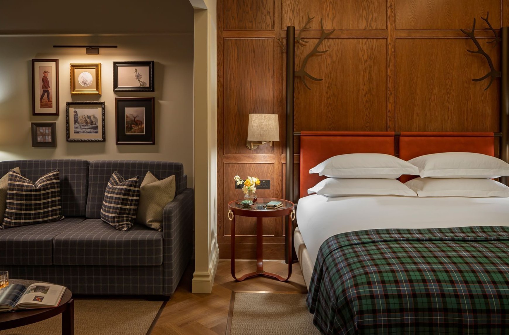


Saltire Blue is central to the brand identity, creating a strong visual presence. The brand symbol represents the hotel, directly referencing Seaton House’s original architectural drawings—specifically, the first gable of its roof. The strapline, Where the Tides of History Rest, is designed to be transportive, reflecting the rich stories that shape St Andrews. As a seaside town on Scotland’s East Coast, its ever-changing tides symbolize the passage of time, deep heritage, and the hotel’s role as a place of rest and relaxation. Illustration also plays a key role, with a curated mix of artists capturing both the town and hotel. Unified by the brand palette, these elements create a cohesive, authentic identity that seamlessly blends past and present.