


Pulitzer Garden, Amsterdam
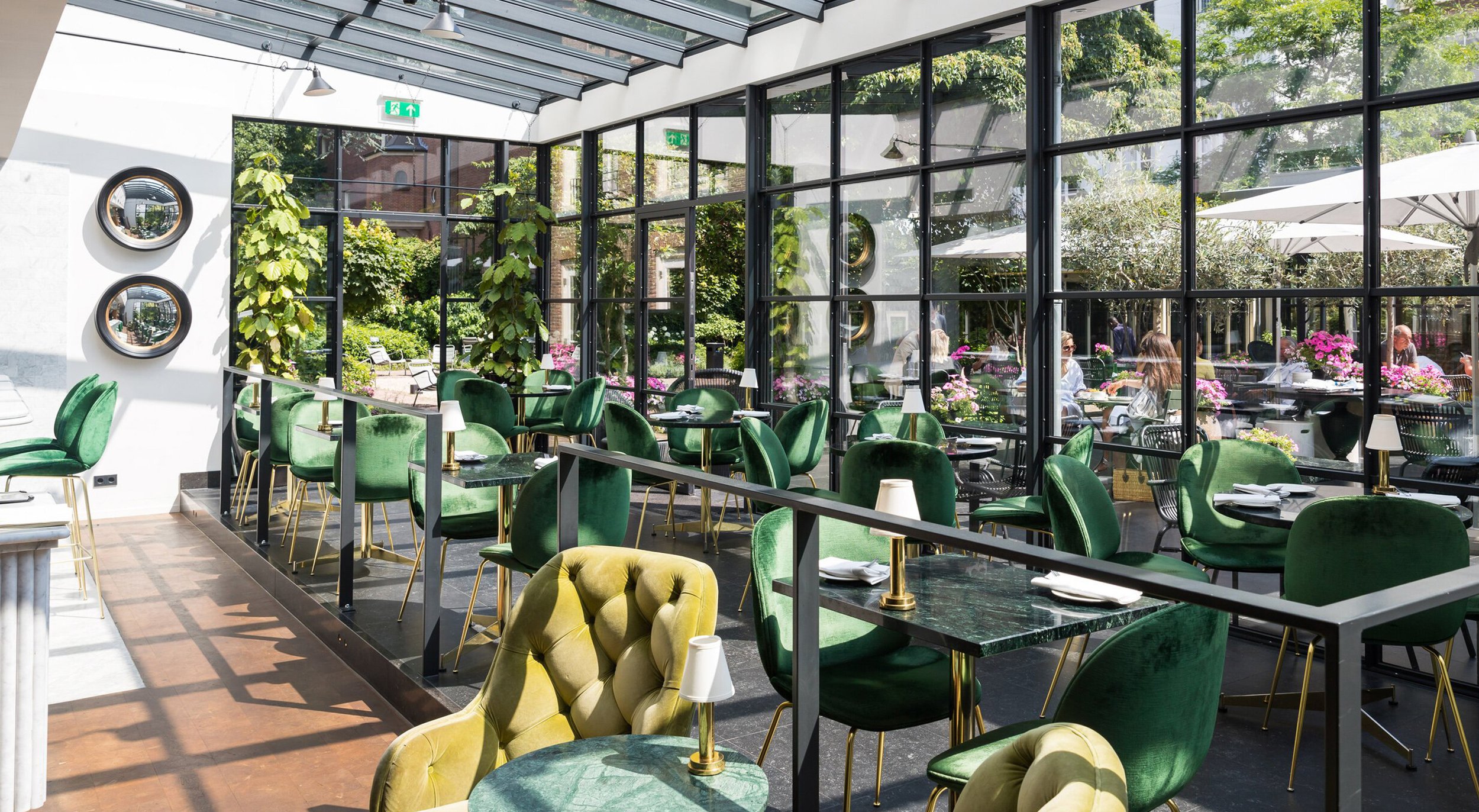
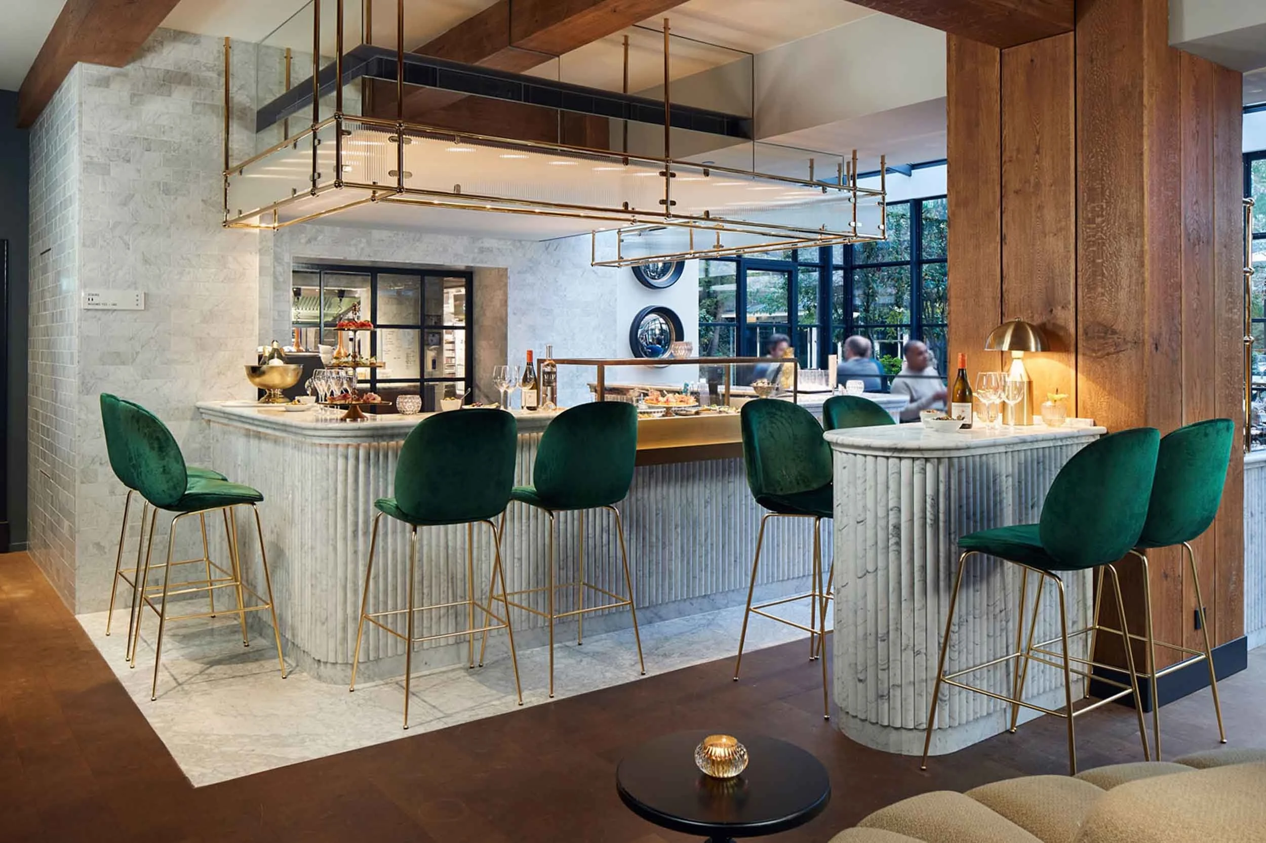
At the heart of the Pulitzer Hotel in Amsterdam lies the Pulitzer Garden, a serene courtyard oasis offering a tranquil escape from the bustling city. Perfect for casual breakfasts, morning coffee, a glass of wine, or a beautifully crafted plate of pasta, this hidden gem blends relaxation with understated elegance. Surrounded by historic canal houses, it provides a calming retreat for both locals and hotel guests. We were approached to craft a new identity for the space, ensuring alignment with the hotel’s branding while incorporating distinctive elements to enhance its charm and unique character.
BAR BRAND IDENTITY
ILLUSTRATION
BRAND GUIDELINES
DESIGN FOR PRINT

With the hotel represented by a strong, masculine, beveled wordmark, softening the identity of the garden was a key part of our brief. The interior spaces, bathed in natural light, and the exterior grounds, open to the vast blue sky, inspired a color palette that harmonized with the environment. Our challenge was to create a distinct identity that felt true to the garden’s serene character while remaining aligned with the overarching brand, achieving a careful balance between differentiation and cohesion.


The resulting brand identity employs softer colours and tones derived from the parent palette to create a lighter, more approachable collateral. A custom symbol featuring the letter “P” from the hotel wordmark was designed, seamlessly connecting the identity to the hotel while incorporating growing foliage to represent the garden and soften the typography’s hard edges. Inspired by the interior’s strong horizontals and verticals—seen in structure and printed textiles—we developed two sets of stripes as a visual asset. These elements harmonize with the interior direction, enhancing the brand’s cohesion while reflecting the garden’s tranquil and organic essence.