


Le Pont De La Tour,
London
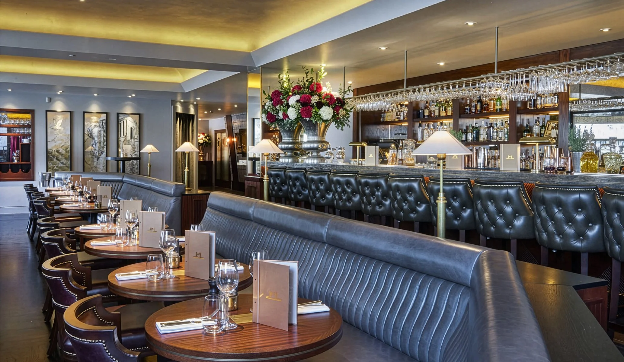
Since the early ’90s, London’s iconic South Bank has been home to Le Pont de la Tour, one of the first restaurants to pioneer the now-thriving, luxury Thames-side dining scene. A true landmark, it has long been celebrated for its elegant ambience and cuisine. We were tasked with refreshing its branding—modernising its identity while preserving the elements that have made it a beloved destination for decades. The challenge was to refine the brand, ensuring it evolved while preserving the equity and recognition of its original identity.
RESTAURANT BRAND IDENTITY
RESTAURANT REBRAND
ART DIRECTION
ILLUSTRATION
DESIGN FOR PRINT
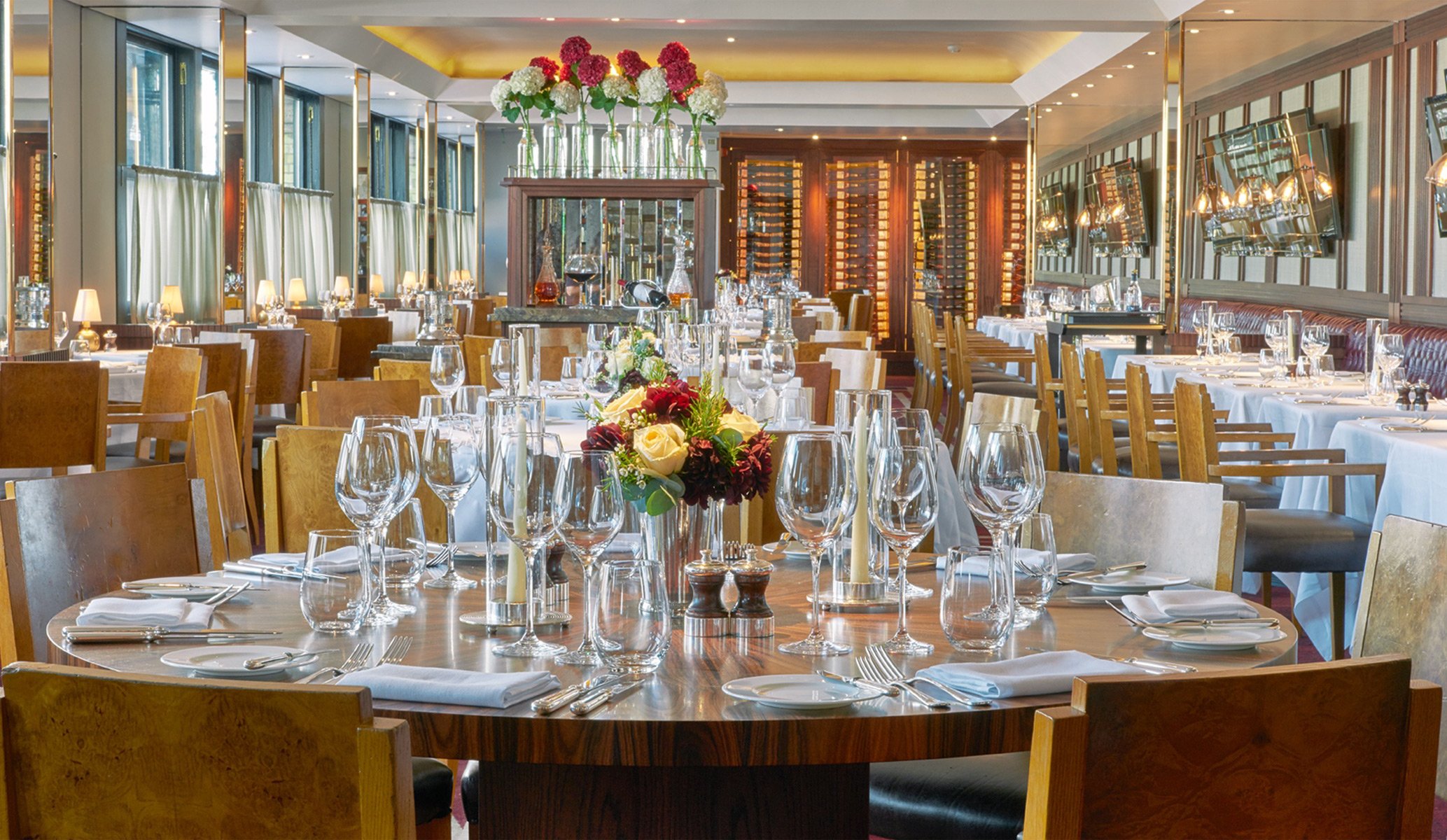

The restaurant’s iconic Tower Bridge location remained central to the brand. We explored a range of design approaches, from the most minimal interpretations to more intricate executions. Ultimately, we refined and redrew the original logo, staying true to its heritage while elevating its sophistication. This subtle evolution allowed us to push other aspects of the brand identity further—removing the dominant primary blue and introducing refined copper tones and warm greys. These changes aligned seamlessly with the restaurant’s interior design, creating a more cohesive, high-end aesthetic that reflected its place in the London dining scene today.

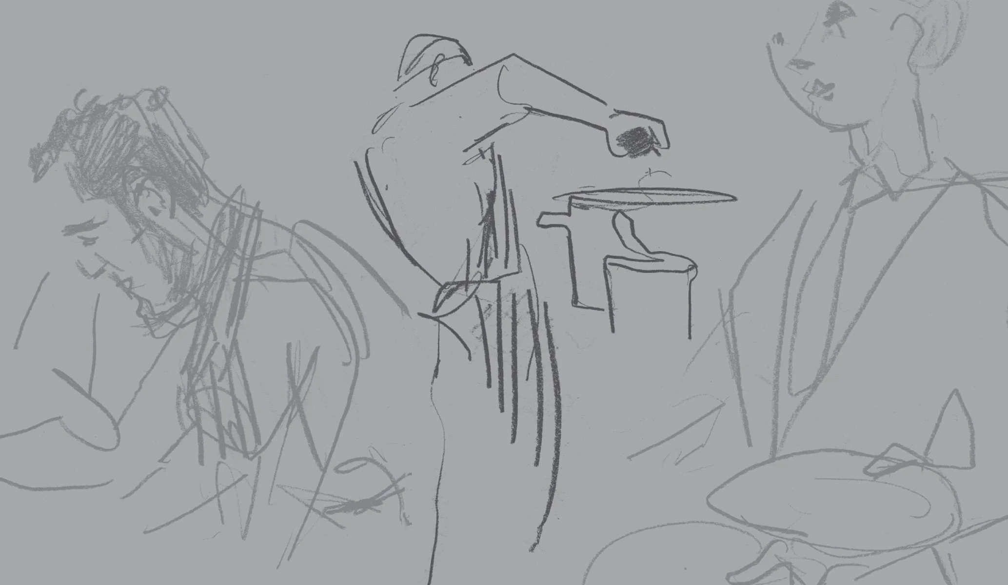
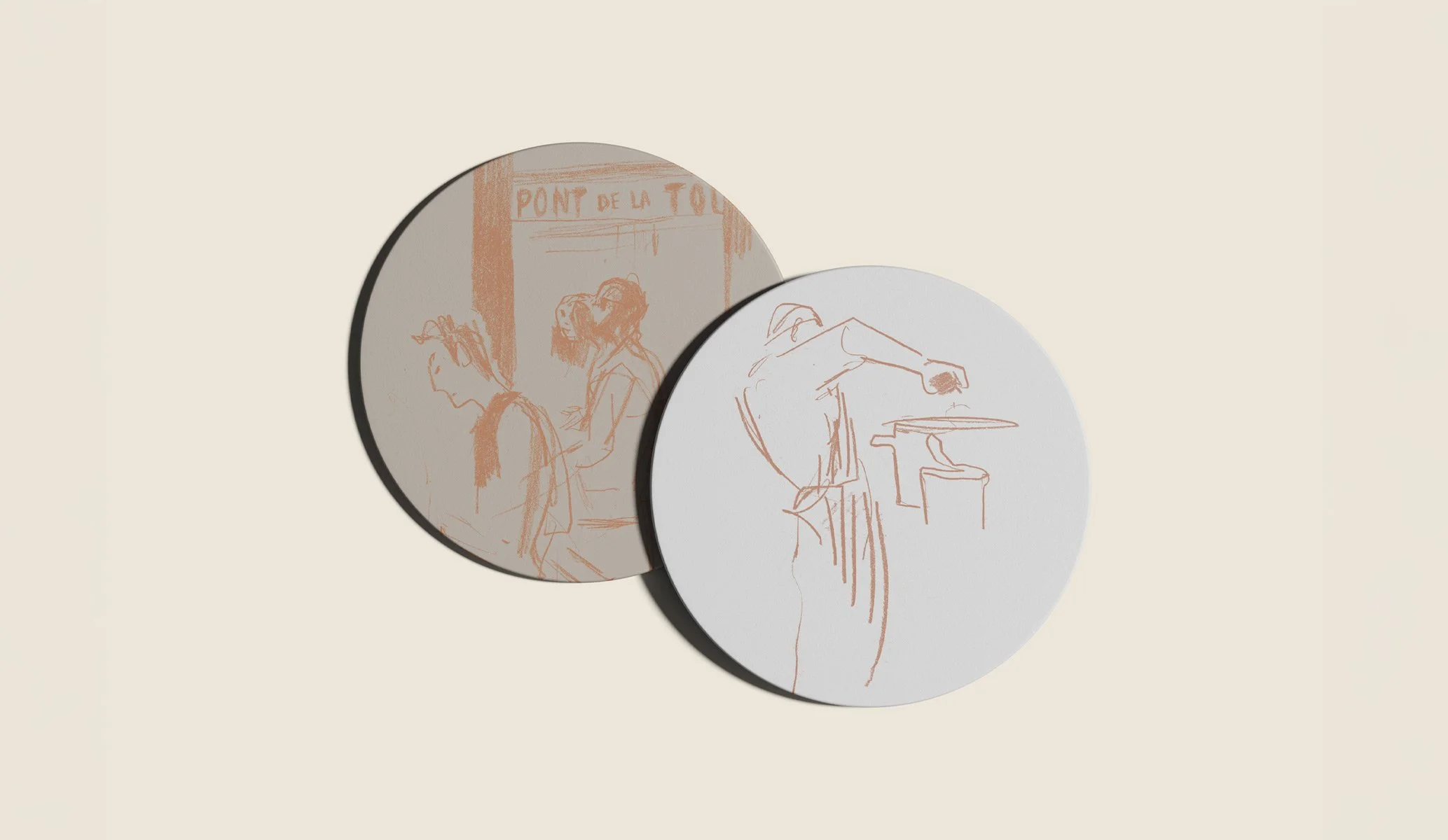
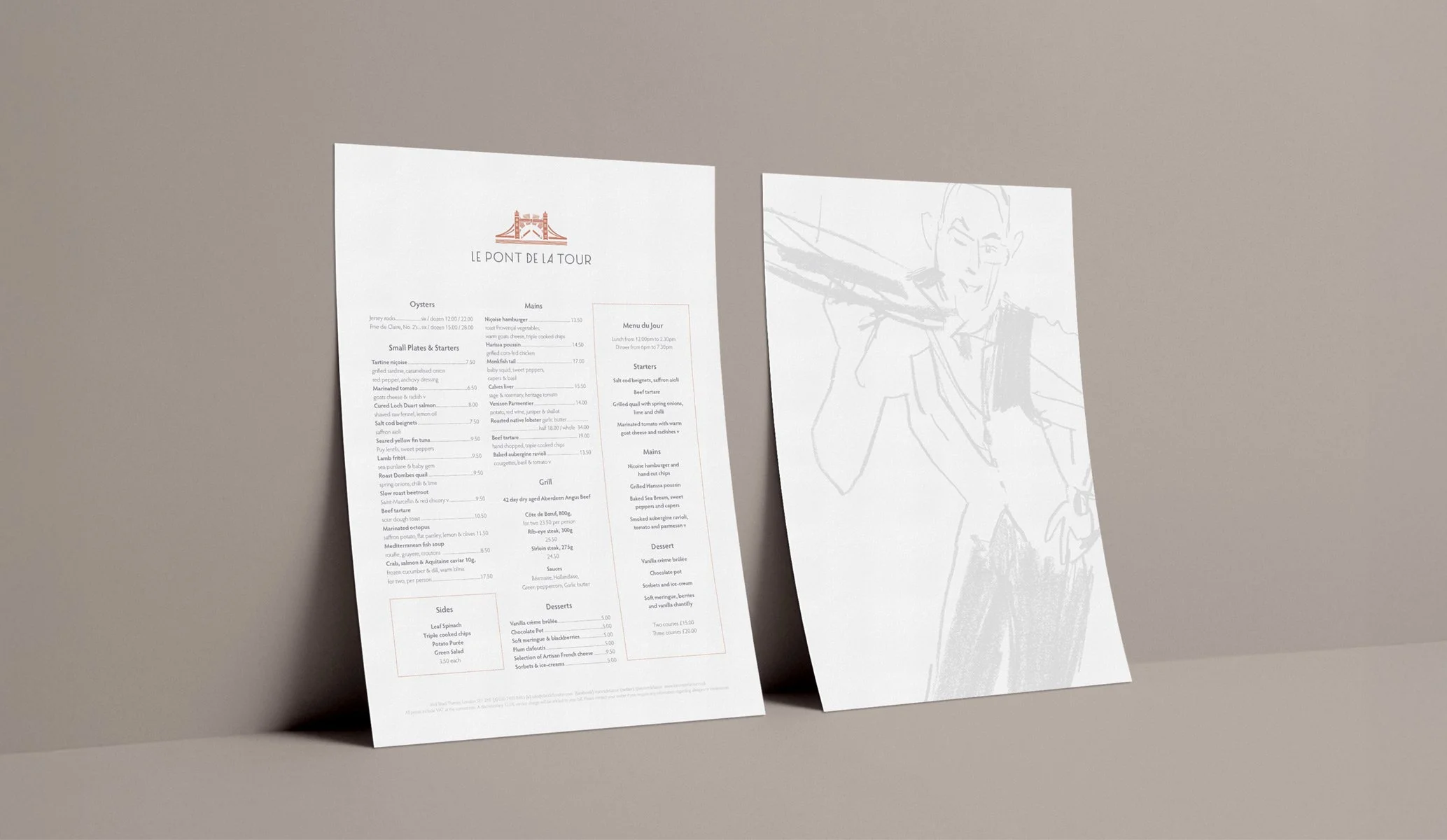

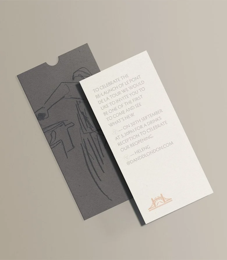
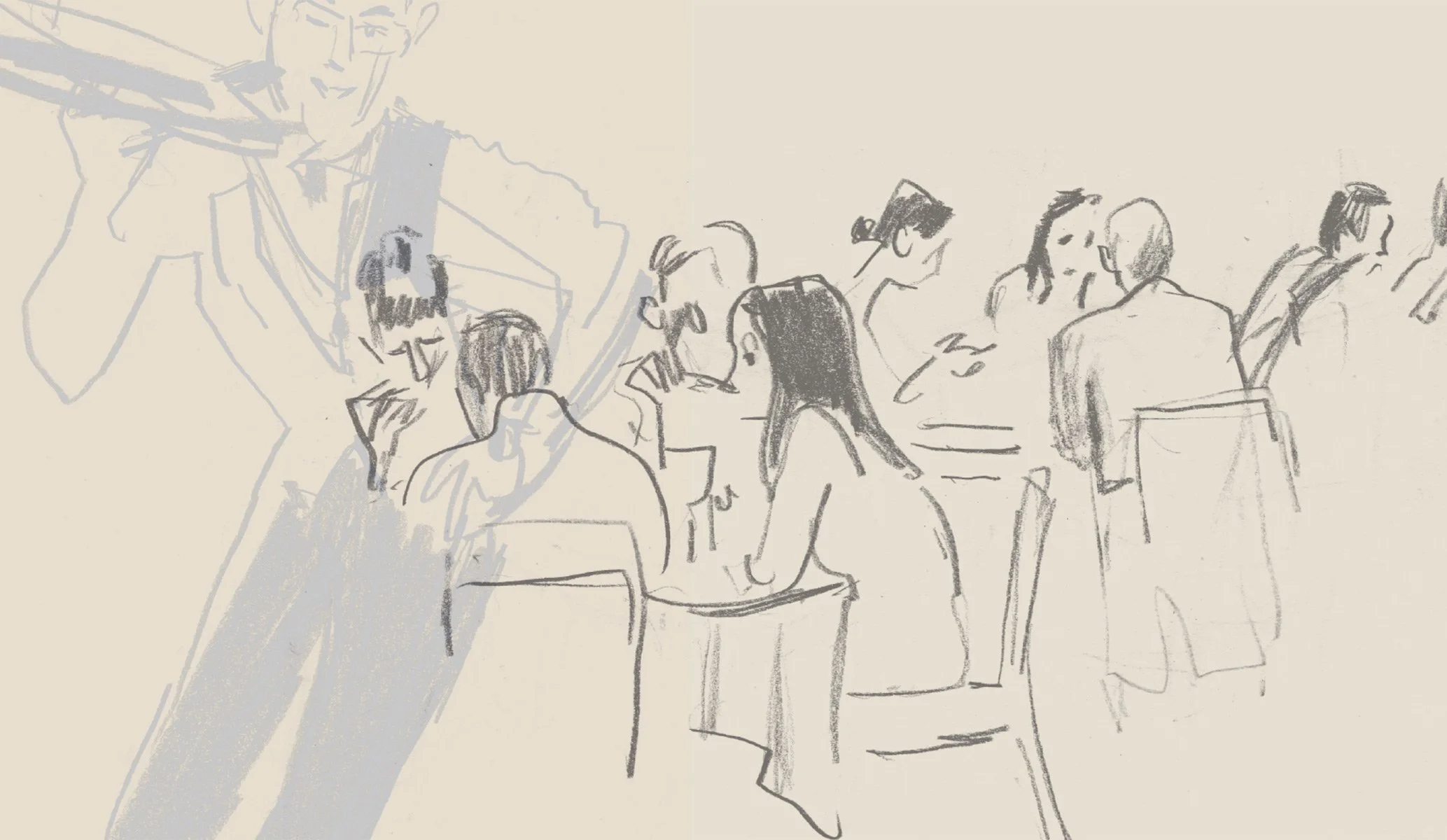
Inspired by elegant French typography, we introduced a bespoke wordmark to replace the original heavy, masculine version. This refined update brought a sense of sophistication and balance to the brand. Copper foils and metallic papers were incorporated across print materials, adding a touch of luxury and craftsmanship. To further enhance the brand’s identity, we created a set of illustrations depicting modern life along the river, adding movement and energy. The result is a brand that seamlessly blends heritage with contemporary style, perfectly representing Le Pont de la Tour in the 21st century.