Paternoster Chop House, London
Paternoster Chop House, located beside St. Paul’s Cathedral, is a celebrated British restaurant known for its hearty dishes such as steaks, chops, and roasts with its in-house butchery adding authenticity and a unique touch to the menu. The restaurant’s name reflects its location in Paternoster Square, historically central to London’s publishing industry and redeveloped post-WWII after significant bombing but more recently the restaurant gained fame as the original filming location for Channel 4’s First Dates. When we were approached to address the brand identity, everything was neat and tidy, but the venue’s true character and personality were not being communicated which felt like a huge opportunity missed.
RESTAURANT BRAND IDENTITY
RESTAURANT REBRAND
ART DIRECTION
ILLUSTRATION
DESIGN FOR PRINT
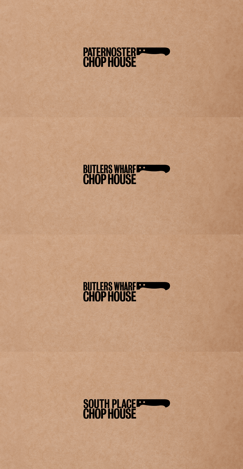
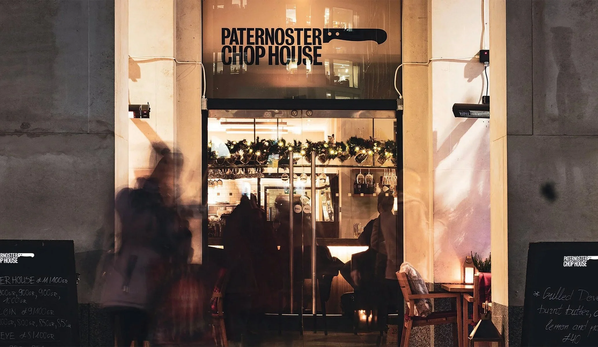

The original identity was limited to a condensed, all-caps wordmark and a black-and-white colour palette. While the wordmark needed to be retained, we sought ways to elevate the brand. Inspiration came from an unexpected source—a giant meat cleaver statue in the restaurant window. So we incorporated a handle into the logo, reflecting this bold, structural detail. Sometimes the best ideas really are staring you in the face. With this key element communicating the venue’s essence, we expanded the visual identity to add depth, further telling the story and enhancing the overall design.
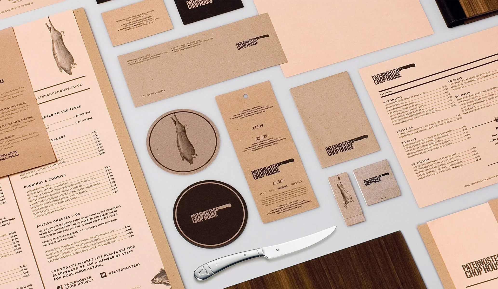
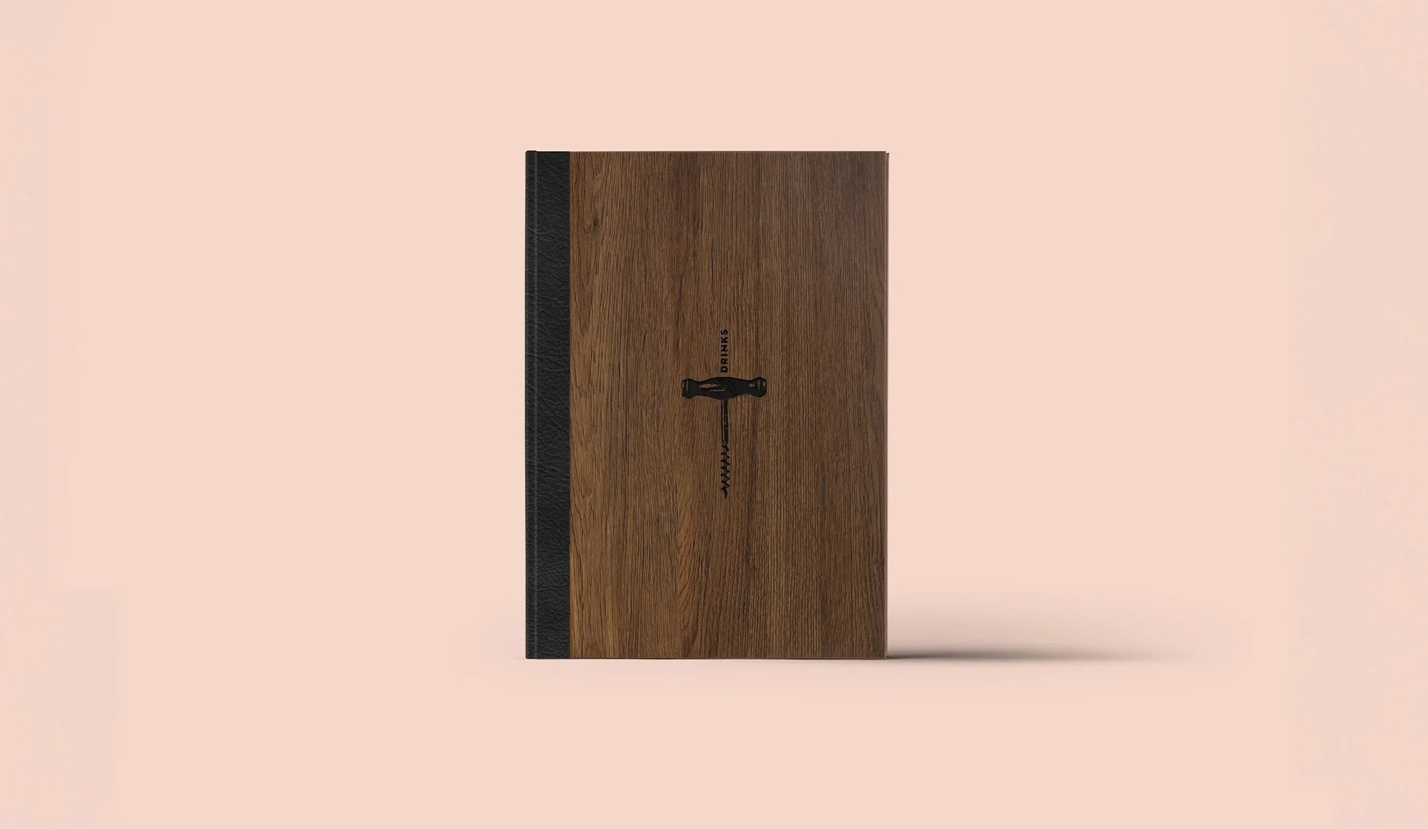
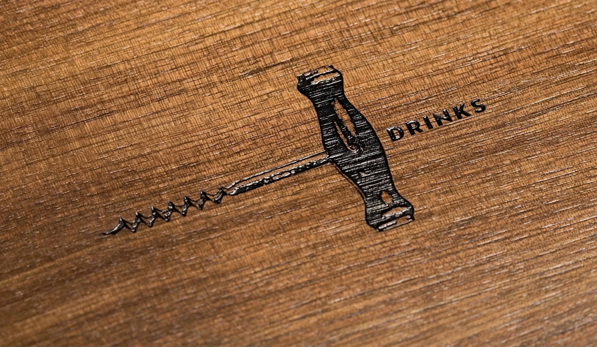
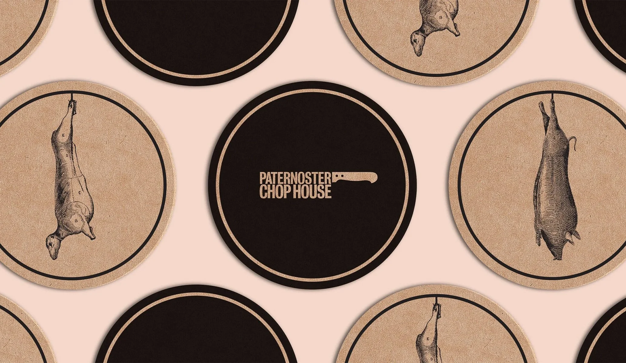
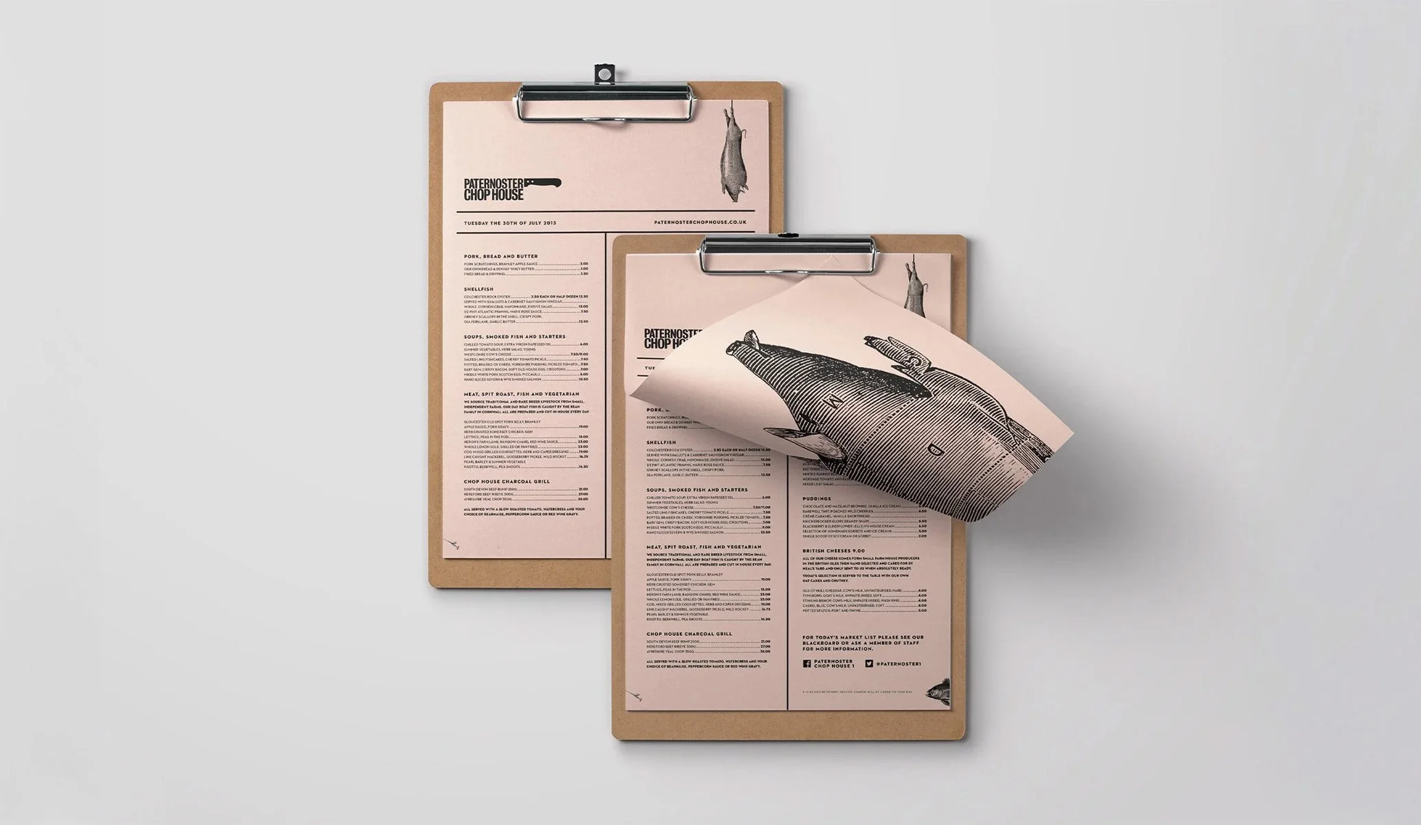
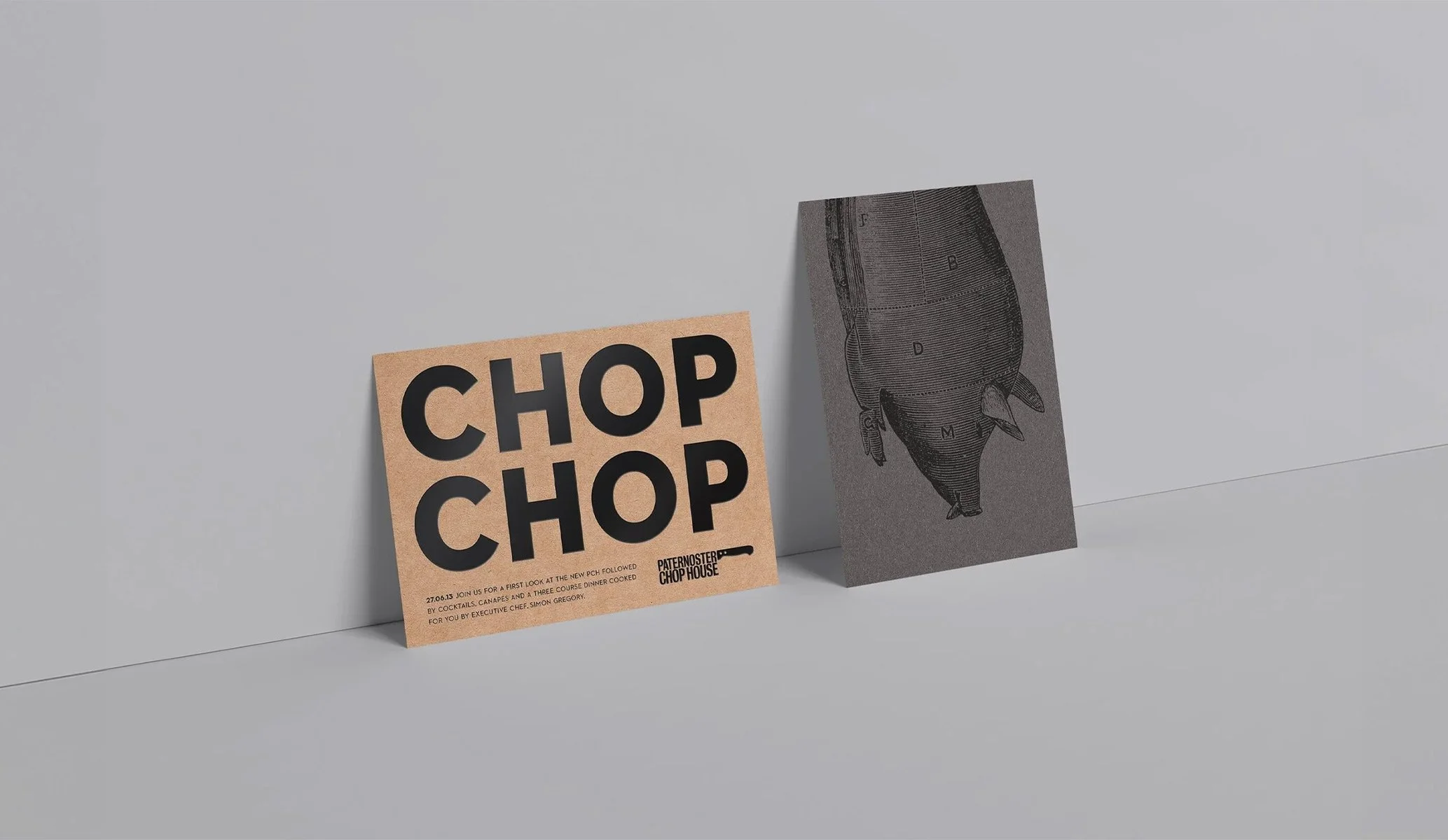
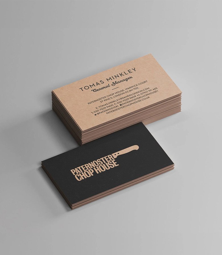
The interior of the restaurant provided a wealth of visual inspiration, from its rugged, masculine aesthetic to the hearty food it serves. We embraced this with tough, heavy papers, wood, and a distinctive salmon pink—a subtle reference to the Financial Times and the restaurant’s location in London’s financial district. The base for the identity was set, with illustrations depicting animal dissection further enhancing the restaurant’s tone. This created a brand that made as bold a statement as the food itself. The rebrand proved so successful that it was eventually rolled out across other restaurants in the D&D London group.
More restaurant brands by Colt