Madhu’s of Mayfair, London
Madhu's is one of London's most celebrated Indian restaurant brands, renowned for bringing together generations of Punjabi hospitality with contemporary fine dining. Founded by the Anand family, the business has earned an international reputation through its award-winning restaurants, luxury events and prestigious catering. As the first Asian caterer to serve at Buckingham Palace, Madhu's has become synonymous with exceptional hospitality at the highest level.
At the heart of the brand is Madhu's of Mayfair, an elegant restaurant housed within the historic panelled Oak Room on Piccadilly. Built in 1908 as part of the original Piccadilly Hotel, it offers a distinctive luxury dining experience in an iconic London setting.
RESTAURANT BRAND IDENTITY
BRAND GUIDELINES
DESIGN FOR PRINT
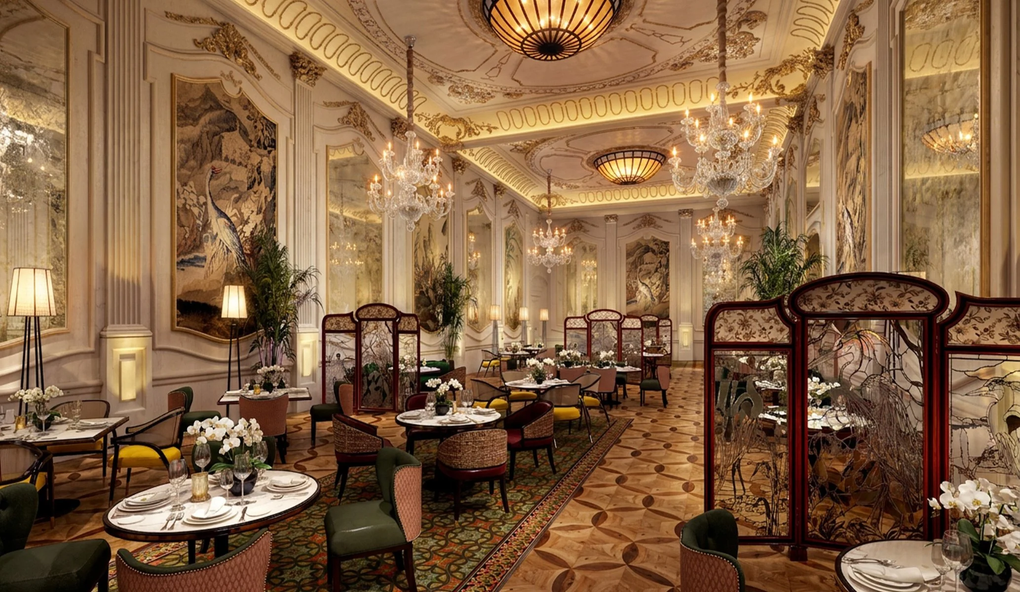
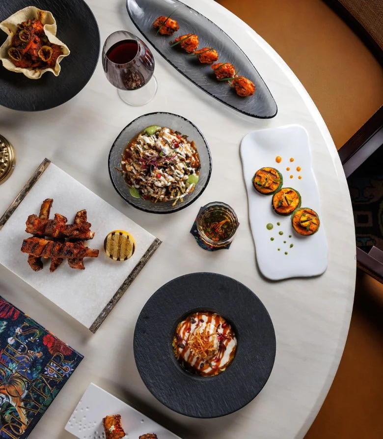
As Madhu's of Mayfair entered a new chapter alongside the transformation of the hotel it calls home, we were commissioned to evolve the restaurant's visual identity while maintaining a connection to the wider Madhu's brand. Our brief was to create a richer expression for the flagship restaurant, drawing inspiration from the grandeur and intricate detailing of the Oak Room to develop a brand every bit as expressive as its unapologetically ornate setting.
Every successful identity begins with a clear point of view. Through our positioning work, we identified three qualities that set Madhu's of Mayfair apart: generations of culinary expertise, exceptional hospitality and one of London's most extraordinary dining rooms. These foundations gave the project a clear strategic direction, allowing us to create an identity that expressed more than luxury alone. It became a brand that celebrated heritage, elevated the guest experience and confidently claimed its place as London's grandest curry.
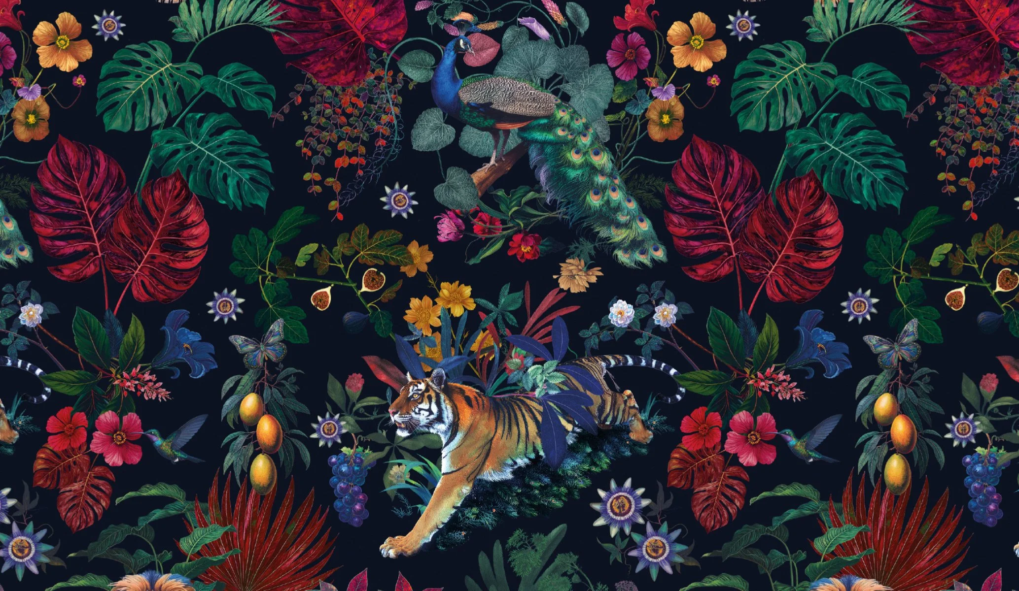
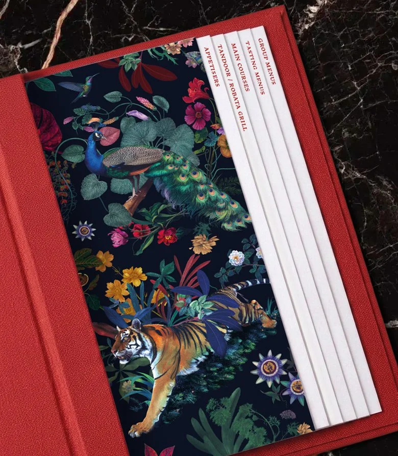
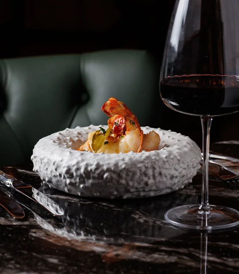
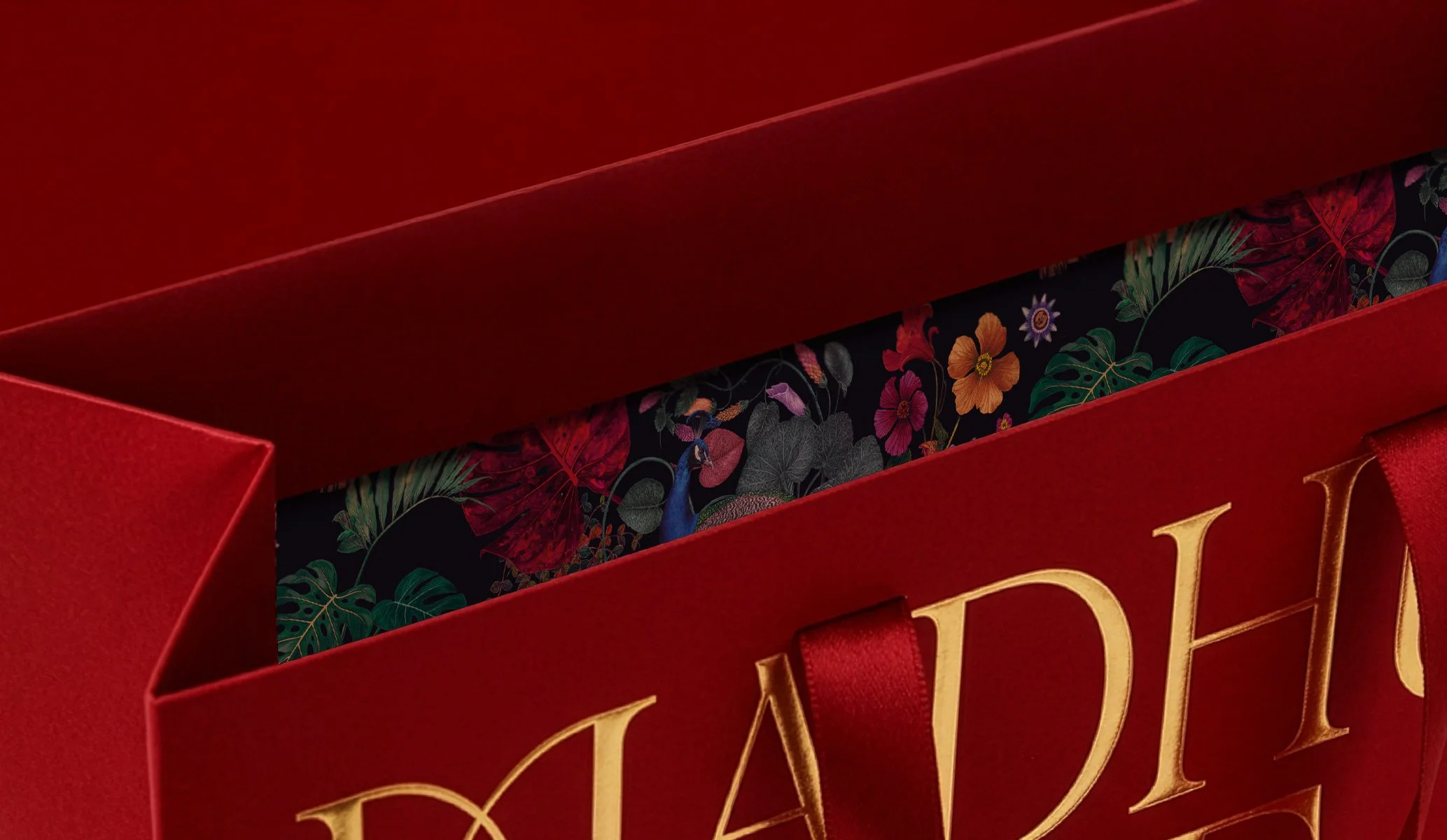
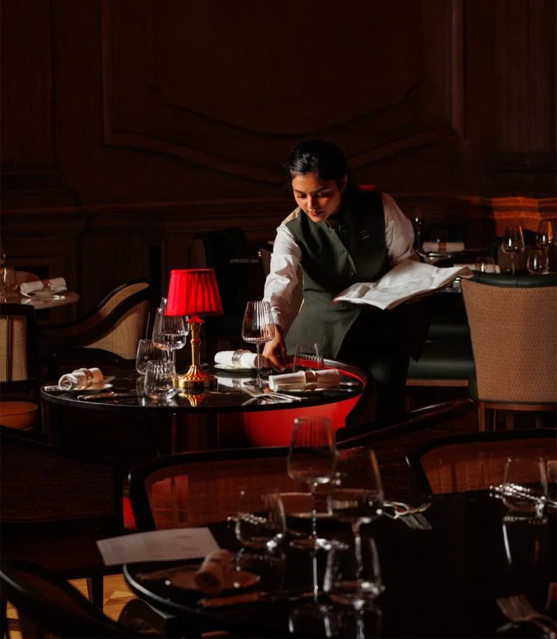
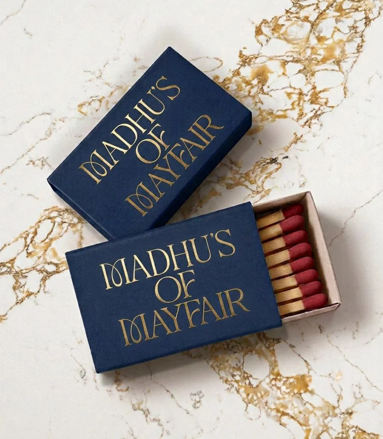
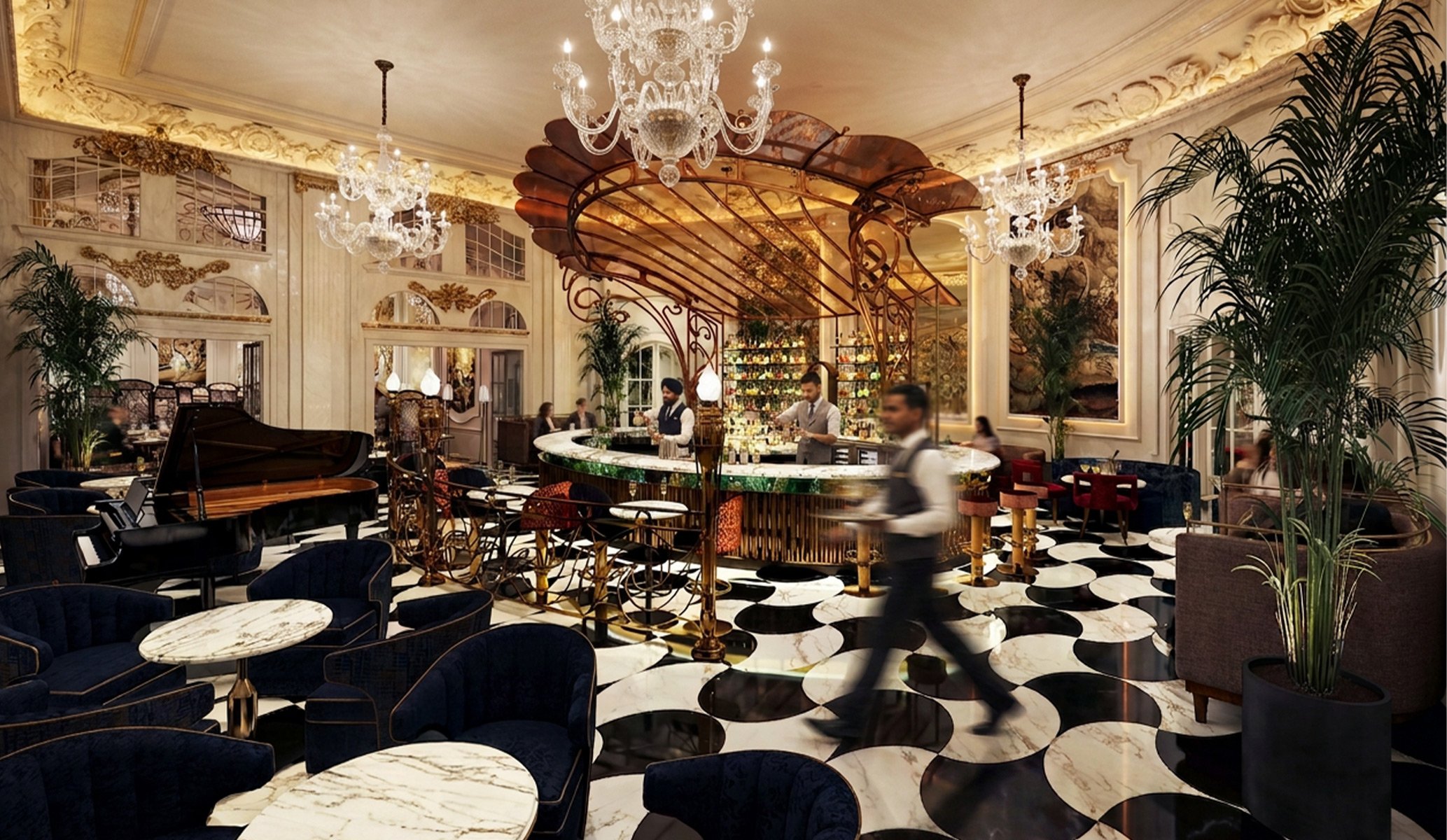
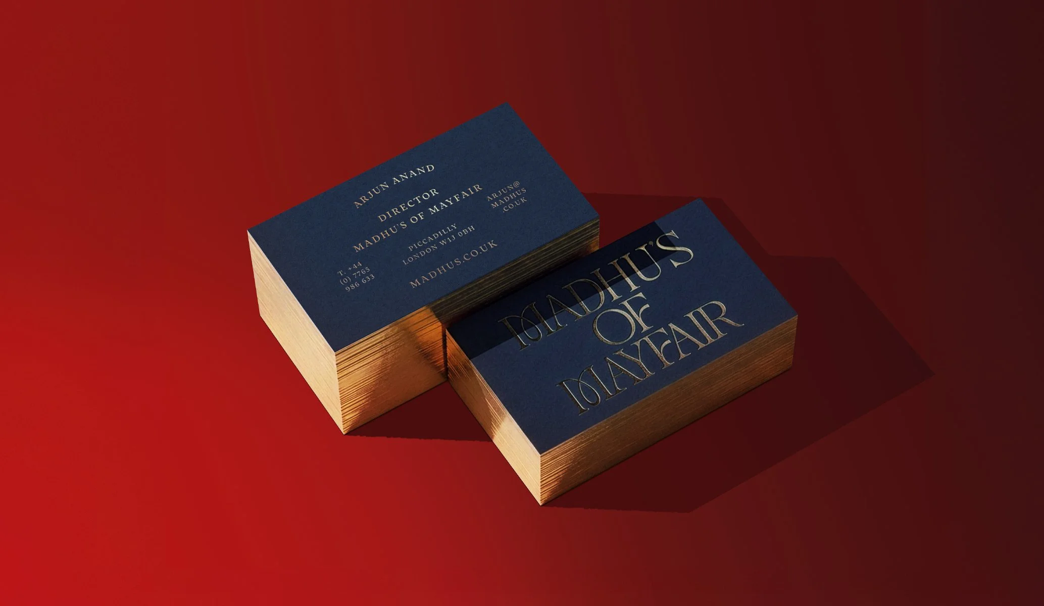
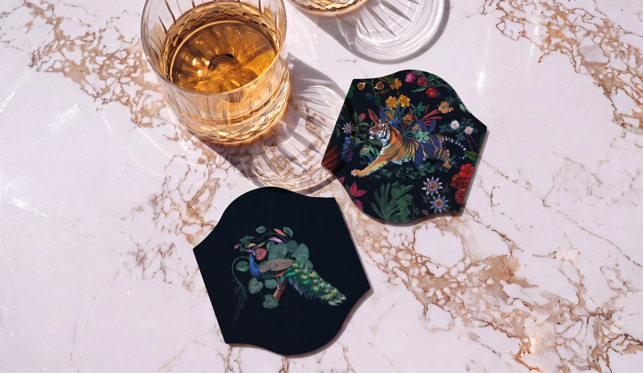
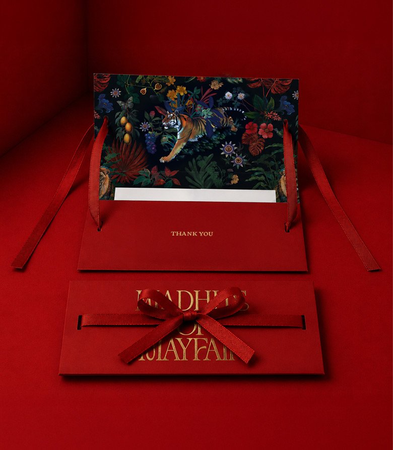
With the identity living within two palatial oak-panelled rooms – a bar and restaurant adorned with crystal chandeliers, carved timber and gilded detailing – we chose to embrace the building's theatrical grandeur. The result is a rich, expressive visual language that turns up the volume, celebrating its lavish surroundings.
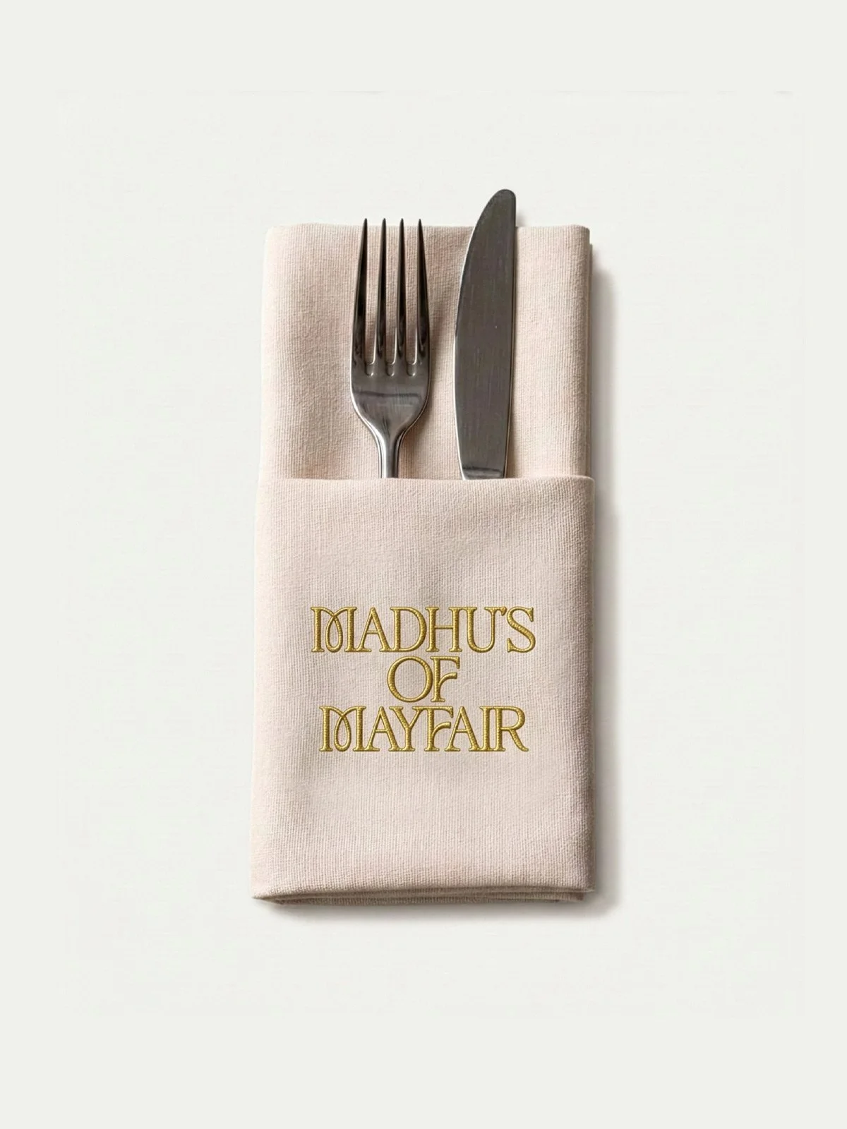
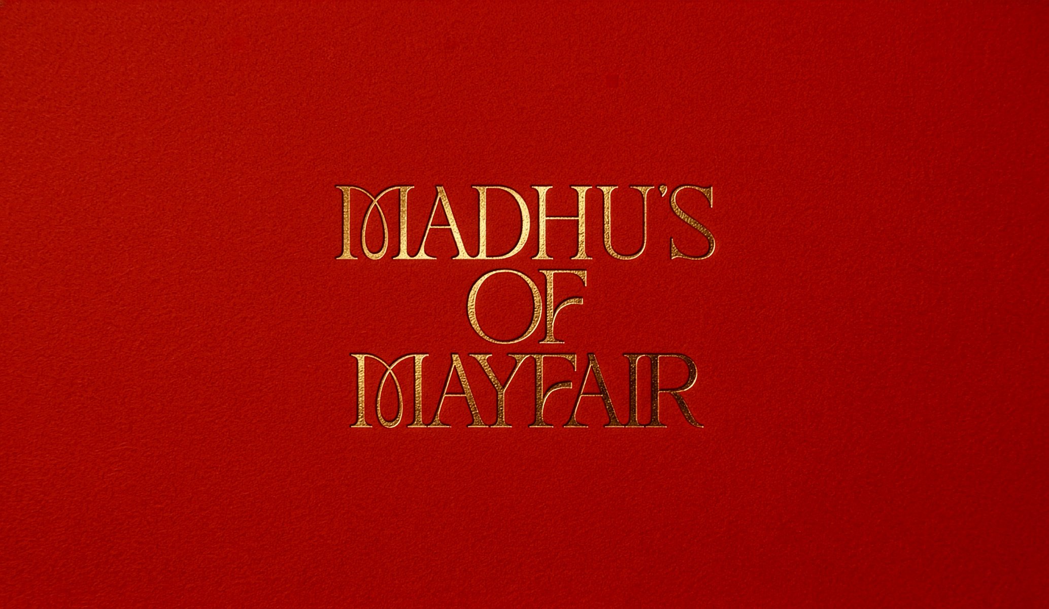
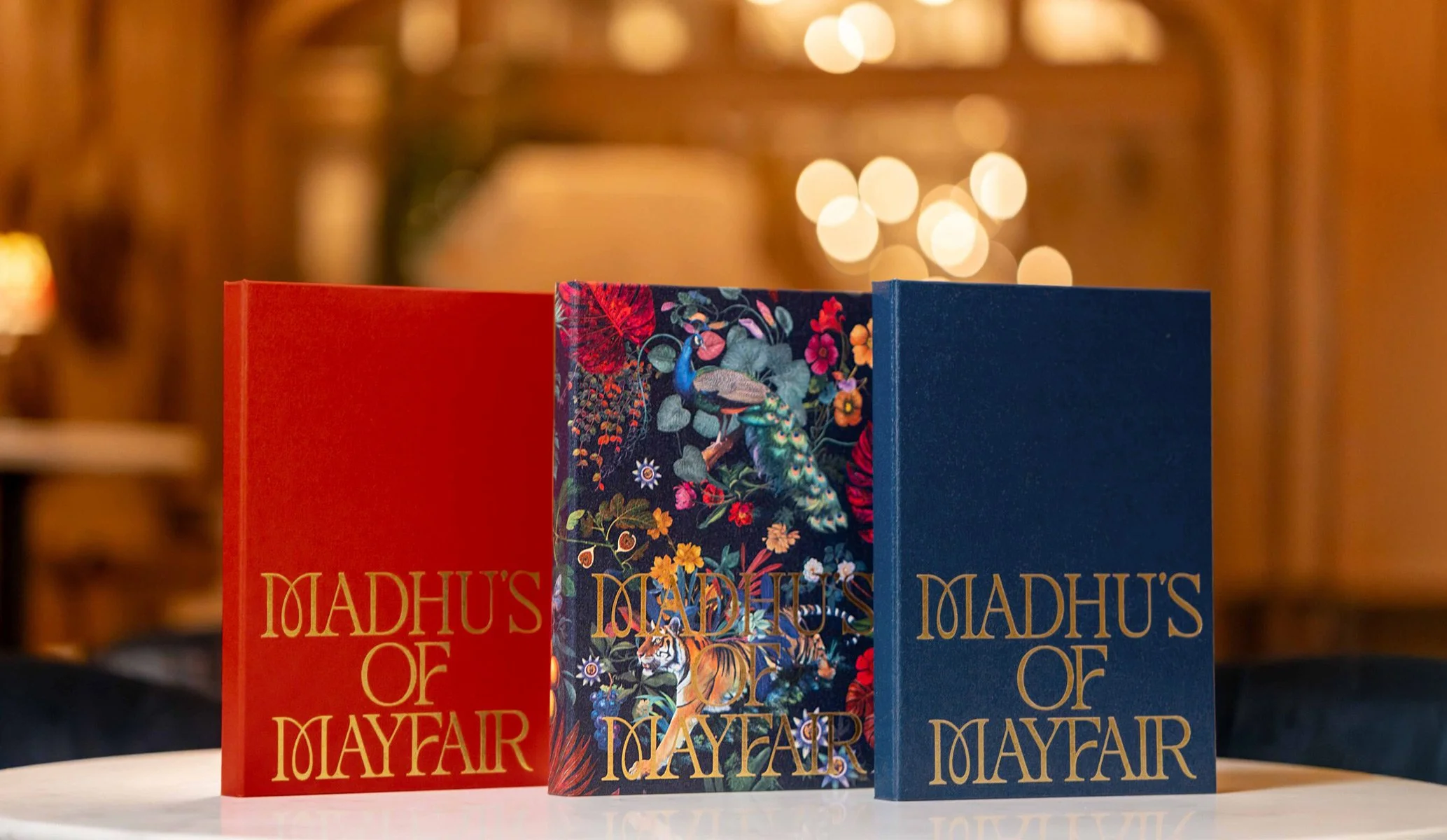
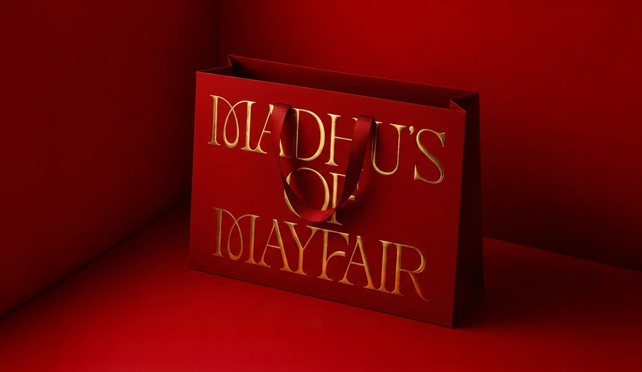
At the heart of the identity is a distinctive wordmark, designed to be produced in gold foil wherever possible, reinforcing the restaurant's premium positioning. The signature Madhu's red has been retained and paired with a deep blue palette, while an intricate illustration adds richness, depth and flexibility throughout the identity.
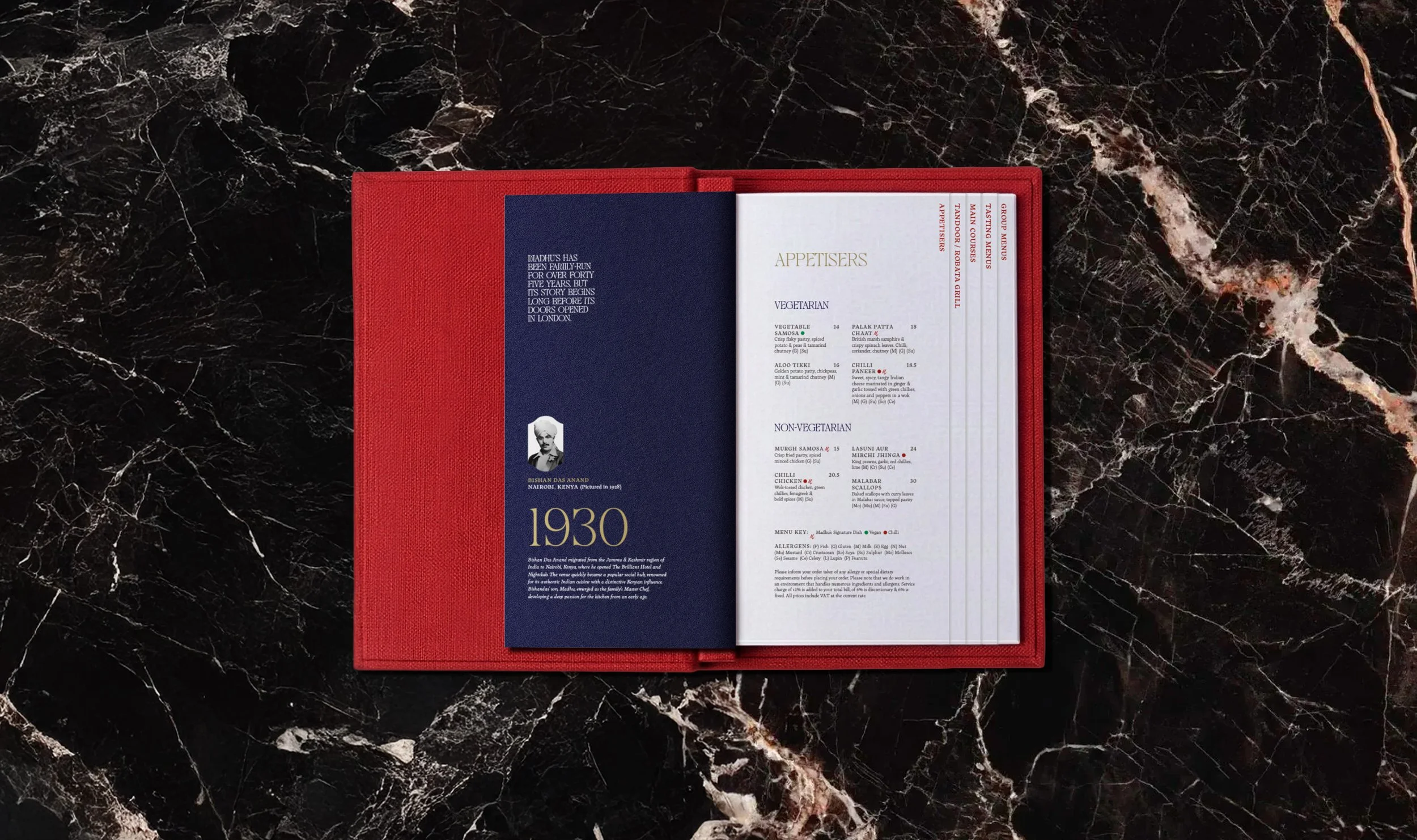
With an extensive menu spanning hundreds of dishes, from tasting menus to the tandoori grill, we also addressed the guest experience through thoughtful menu design. A clearer information hierarchy makes the offer easier to navigate, while an illustrated timeline traces the Madhu's story from 1930 to the present day, weaving the family's proud heritage into the dining experience.
By extending the identity across every guest touchpoint, from menus and packaging to printed collateral and the wider guest experience, Madhu's of Mayfair now delivers a brand that feels coherent, confident and every bit as memorable as the setting itself.
More restaurant brands by Colt