


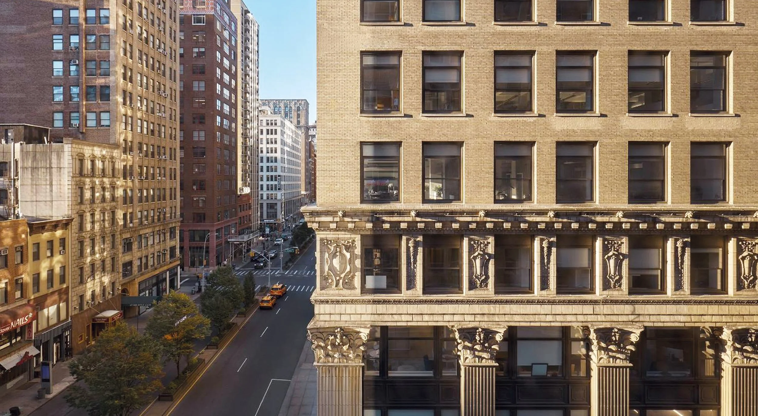
Hotel Park Ave, New York
Hotel Park Ave was conceived to reimagine the site of the former Mondrian Hotel, blending a legacy of bold design with a new, modern ethos. Where The Mondrian embraced opulence, Hotel Park Ave offers a fresh perspective, prioritizing elegant individuality over traditional luxury. This transformation aligns with the evolving needs of today’s travellers, delivering a sophisticated yet approachable experience. Lore Group saw an opportunity to craft a space that reflects the vibrancy of Park Avenue and NoMad while moving away from predicable corporate sterility and we were tasked with creating a brand identity that would encapsulate and express this bold new direction.
BRAND NAMING
HOTEL BRAND POSITIONING
HOTEL BRAND IDENTITY
SIGNAGE
BRAND GUIDELINES
DESIGN FOR PRINT


Our approach to the positioning of the Hotel Park Ave brand was to emphasize individuality and creativity while redefining traditional notions of luxury. We sought to create a brand that reflects the heritage and vibrancy of its Park Avenue location, blending timeless sophistication with a bold, approachable character. The positioning captures a balance of elegance and energy, rooted in the concept of “Stay Bold,” which invites guests to experience a curated space designed to inspire connection, self-expression, and exploration. By aligning with New York’s dynamic essence, the brand embraces creativity and style while offering a distinctive, memorable experience.


The brand identity for the hotel combines the bold and the beautiful through consistent use of colour and type, embracing Albertus, a 1930s-era serif typeface, for its wordmark and headline typography. Its monumental, stone-carved feel adds character and gravitas, reflecting the hotel’s distinct personality and location. The limited colour palette of four key shades complements the minimal, art-gallery-inspired aesthetic while the brand symbol, which incorporates the letters H, P, and A, mirrors the hotel’s architecture, offering a subtle, abstract nod to its structure. The wider visual assets are stripped back, with a flexible, force-justified layout that ensures the brand’s name and location appear uniquely in every context, embodying the blend of creativity and sophistication that the hotel seeks to communicate.