


The Beauty House
We recently had the opportunity to work on the branding for The Beauty House, a new beauty and wellness destination situated in a charming canal house in the heart of Amsterdam. This project presented a unique challenge: encapsulating the essence of a space that blends luxury and comfort in a way that resonates with its clientele.
The interiors were designed by Jacu Strauss, Creative Director at Lore Group. His vision combined warm neutrals with a striking red inspired by vintage Hollywood lipstick, and this bold red became a key focal point in our branding process, representing both confidence and beauty.
BRAND IDENTITY
ILLUSTRATION
DESIGN FOR PRINT
BRAND GUIDELINES

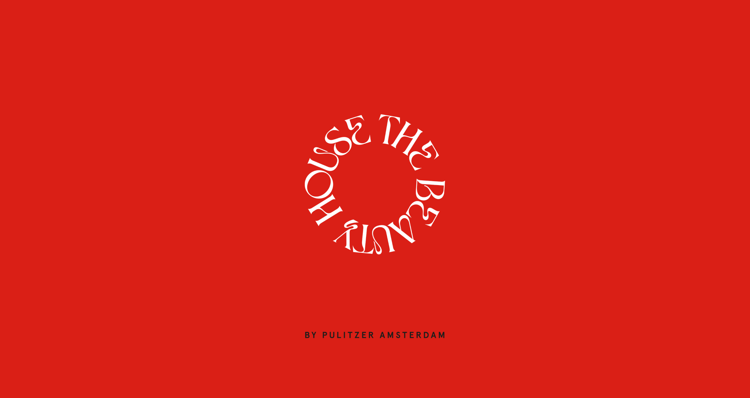


Our approach to the brand identity was straightforward yet impactful. We emphasised the striking red while maintaining a sense of sophistication throughout the design. The brand is anchored by an ornate serif typeface, which adds a touch of elegance without feeling overly formal. To enhance the overall aesthetic, we introduced tactile, organic shapes that evoke a welcoming atmosphere.
The end result is a brand identity that feels cohesive and modern, yet retains a timeless quality. It effectively reflects The Beauty House’s commitment to providing premium services in a relaxed setting. Our goal was to create a visual identity that stands out while remaining approachable—a balance that mirrors the experience offered within the space.


Working on this project was a rewarding experience, as it allowed us to explore how design can influence perceptions of beauty and wellness. We believe our branding captures the spirit of The Beauty House, showcasing its unique offerings without overshadowing its core essence.
We specialize in creating brands for the beauty and wellness sectors, focusing on authenticity and emotional connection. With The Beauty House, we aimed to develop an identity that resonates with its audience, establishing a strong visual presence in a competitive market.