


25 Paul Street
25 Paul Street is a bar in the heart of Shoreditch, East London. Originally built as a townhouse over a century ago, the address once housed a leading bullion trader before evolving into a the playful and immersive venue it is today. We were briefed to create an extroverted but sophisticated brand identity that would help the venue communicate externally what it’s all about internally; extravagant nights that feed the soul, where everyone is welcome to join the party in their own unique way.
BAR BRAND POSITIONING
BAR BRAND IDENTITY
BRAND GUIDELINES
DESIGN FOR PRINT
SIGNAGE

Brand positioning for a bar in Shoreditch, one of London’s most competitive nightlife hubs, was a crucial element of this project. Defining the venue’s identity became the launchpad for the creative direction that followed. 25 is somewhere you can be you, even if being you means becoming someone else entirely. Our creative would invite guests to cross the threshold into a kaleidoscope of absolute freedom where staff and guests alike are liberated from the everyday and welcomed into a world of glamour, sophistication and what could be.


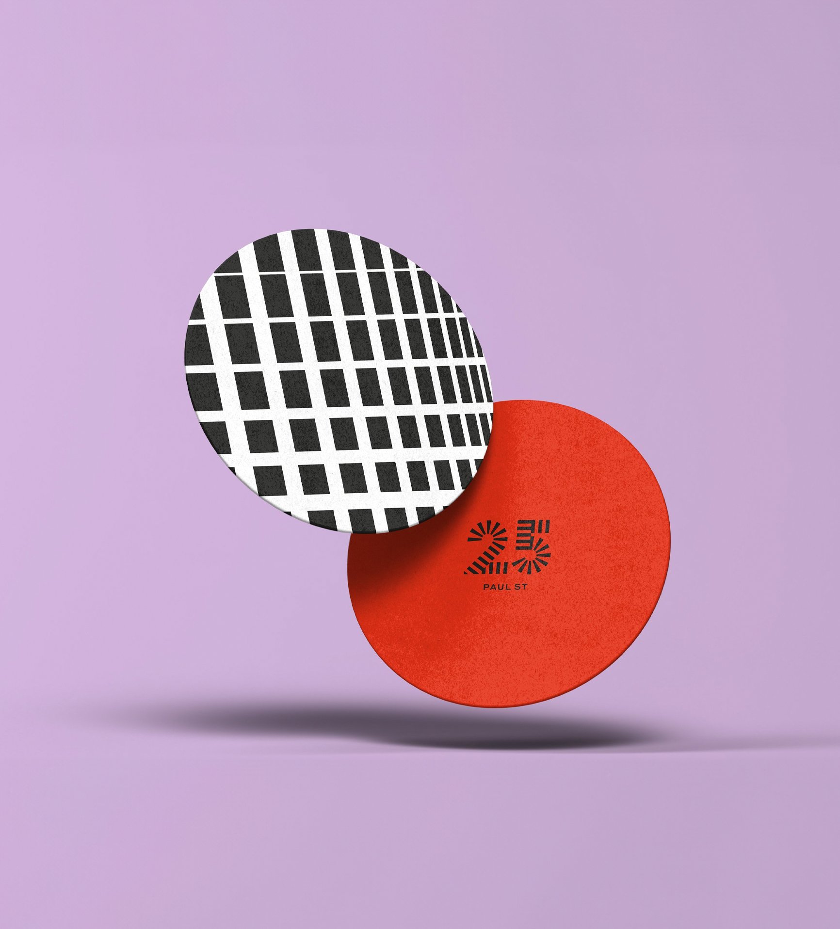
Bold primary colours were selected to make a striking statement, inspired by the venue’s interior lighting and broader colour palette. These vibrant hues are contrasted by dynamic black-and-white patterns, drawing inspiration from Bridget Riley’s iconic artwork, while also referencing the venue’s unique projection mapping and the striking monochrome bathroom tiles. The striped logo further echoes these design elements, and its form is intentionally aligned with the archway of the exterior brickwork above the main entrance. This seamless integration of visual cues from both the interior and exterior creates a cohesive, immersive identity that reflects the venue’s bold character and dynamic atmosphere.