

100 Wardour St, London
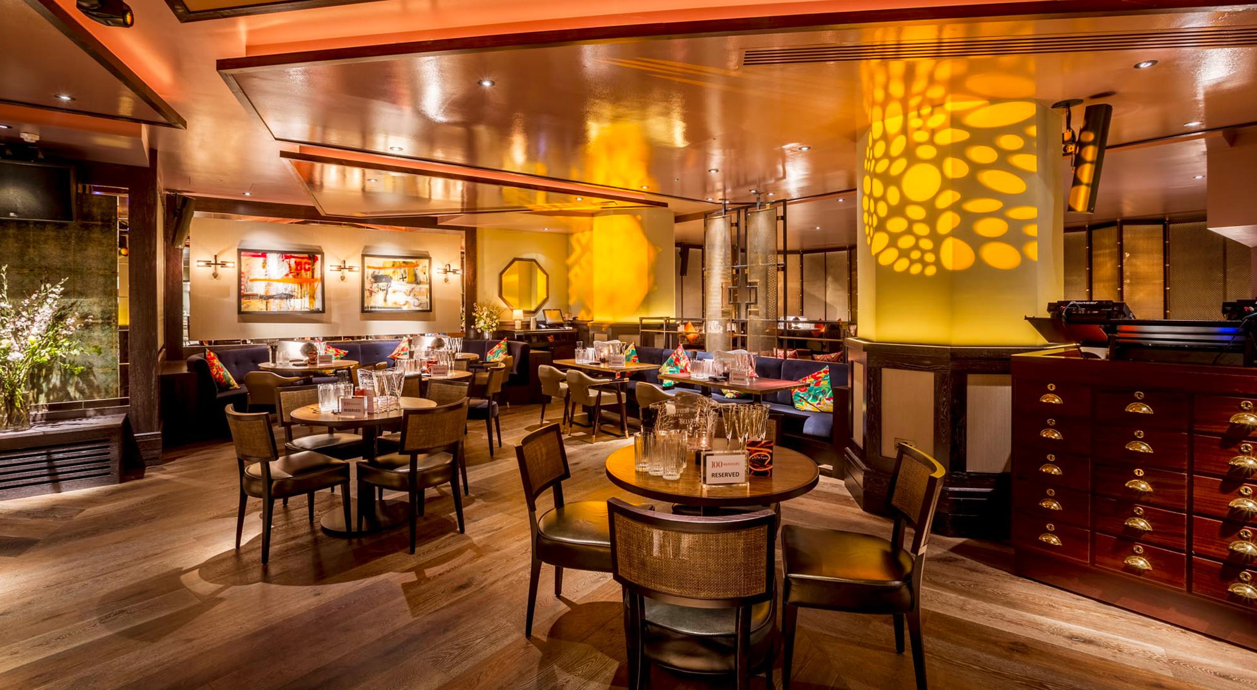
100 Wardour St is a venue with a rich history. Once the site of the iconic Marquee Club in the 1960s, it hosted legendary performances by acts like The Rolling Stones and David Bowie. Today, it features a ground-floor lounge for casual dining and cocktails, and a basement restaurant offering live music and DJ performances, blending chic interiors with Soho’s creative energy. Its legacy as a cultural hotspot makes it a landmark in London’s nightlife and entertainment scene. We were tasked with creating an identity for the venue that communicated its daytime and evening offers, linking both to a cohesive and compelling master brand identity.
RESTAURANT BRAND IDENTITY
ART DIRECTION
DESIGN FOR PRINT


The creative solution centres on the concept of duality. The venue is split into two clear spaces, upstairs and downstairs and each needed to have its own voice, with the basement area predominantly being used in the evenings. Soho is renowned for its historic ‘Red Light’ district, characterized by vibrant neon lights, which inspired our creative direction. We designed custom neon signage to represent each floor: ‘off’ for the upstairs lounge and ‘on’ for the downstairs basement. This visual became central to the venue’s identity, serving as a backdrop and influencing key assets like the logo, which was designed to reflect the same split between the two spaces.


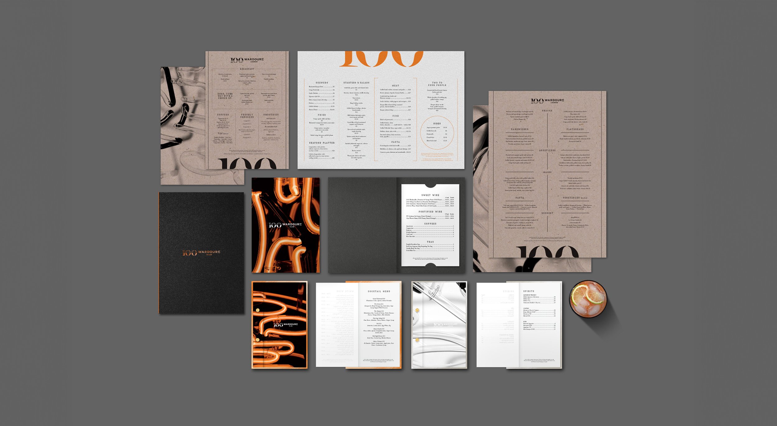


The logo, designed to split into two halves, reflects the distinct nature of the venue’s spaces. In communications, the top half is used for upstairs, while the bottom half represents downstairs, with the two elements coming together in wider messaging for a cohesive identity. Headline typography takes inspiration from stencil-sprayed and painted lettering, subtly nodding to the venue’s central London roots. Paper stocks were carefully chosen to differentiate the spaces further, reinforcing the venue’s duality. The overall design pays homage to Soho’s vibrant past while creating a brand identity that feels contemporary and well suited for the 21st century.